"The Bakery That Delivers"

Project Overview
Sugar Shack, a cupcake and all things sweet shop, located in Lansing, Michigan, has always been a town favorite. From their cookie cakes, to their ever changing array of cupcake flavors every day of the week, Sugar Shack aims to be a one stop sweet shop for any event.
They pride themselves on being "The Bakery that Delivers"
Role: UI/UX Designer | UX Researcher
Date: June 7, 2022 - June 17, 2022
Tools: Figma, Slack, Zoom, Optimal Workshop, Maze, Miro, Google Drive
Methodologies: Jakob Nielsen's Ten Usability Heuristics, Interviews, Competitive/Comparative Analysis, Card Sorting, Affinity Mapping, Persona Development, User flow, Site Mapping, Low-Fi to High-Fi Wireframing, Prototyping, User Testing
To quickly jump to a section, use the navigation below
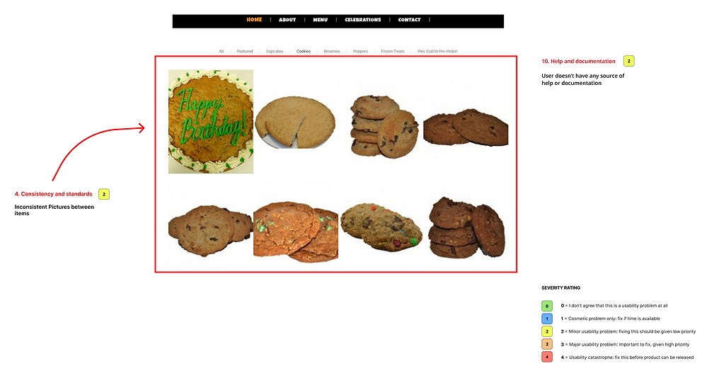
HEURISTIC EVALUATION
Using Jakob Nielsen's 10 Heuristics, I evaluated the current website, to better understand the functionality, flow and visual hierarchy of it.


USER INTERVIEWS
Empathizing with the users, and their take on ordering baked goods online, was the first task at hand. Four individuals, between the ages of 24 to 43 were interviewed via Zoom to understand:
-
How often do users buy baked goods such as pies, cakes, cookies, etc. and with what occasion, if any?
-
Were there any obstacles that the user encountered while trying to buy baked goods or have baked goods delivered?
-
What steps does the user take when having a problem with a product/service?
-
What aspect of online shopping for baked goods is most important to the user?
3 out of the 4 people interviewed will buy with an intention or occasion.
Users enjoy the ability to mix-n-match baked goods.
Users prefer a visual of the item, its ingredients, any allergy warnings and price clearly stated on a product page.


PERSONA
With the data gathered from user interviews, a user persona was developed. Orrick Jones, a traveling nurse, currently resides in Phoenix, Arizona. Some key points about Orrick:
-
Due to their profession, Orrick cannot travel to bakeries every time, and therefore is needed to order their sweets through delivery.
-
They love their sweets, but still keeps price in mind when buying.
-
Orrick believes that reviews make or break a business.

PROBLEM STATEMENT
Sugar Shack has seen a decline in sales due to the difficulty with their site navigation and the lack of an e-commerce system. Customers are needed to place an order via phone or a visit, which can cause frustration for some, due to many customers moving towards digital interactions in order to save time and money. Understanding this, poses the question of:
How might we display important information about our products?
How might we guide the users through our site more efficiently?
How might we make it easier for customers to connect with us?
COMPETITIVE / COMPARATIVE ANALYSIS
Taking into consideration three direct competitors, Achatz Homemade Pies, Good Cakes and Bakes and Christine's Cakes and Pastries, and two indirect comparators, Meijer and Westborn Market, I created a feature inventory, to better aid Sugar Shack in a more appropriate direction. I concluded the following:
Delivery is very important to have, especially within the local areas around the store. Most stores offered delivery, be it from their own site, or an adjacent site, catered to delivering nationwide. While competitors offered delivery, comparators did not, seeing as comparators did not only sell baked goods and were not entirely specialized in it.
A product page is essential when making decisions on what to order. Having a clear understanding of what a product is, its ingredients and price, reassures the user that what they see is what they would receive.


To view the in-depth Competitive and Comparative Analysis, click on the button below.
CARD SORTING
From the existing Sugar Shack site, I collected product names, features and Pages that could be relevant to the redesign, and conducted a Card Sort through Optimal Workshop consisting of 37 cards. Out of 23 participants within the span of six days, here are the important takeaways:
-
Without a clear title to the product, explaining what it is, users will most likely try to group said item with another similar product.
-
Participants placed likely items together, such as pies, cookies and others within their own groups.
To view a full matrix of the Card Sort, click on the button below.
INFORMATION ARCHITECTURE
With the data collected from the Card Sort, I created a Site Map, clearly showing Sugar Shop's new and improved layout.

Design
SKETCHES
From the Site Map created, it was time to channel my inner designer and draw out important screens to iterate later on. For the sake of time, I decided to focus mostly on the Desktop site.

Home Page

Products Menu Page

Selected Product Page
LOW FIDELITY WIREFRAMES
From the sketches above, Low Fi Wireframes were developed. A few important details were added to the model:
-
A brand new check-out page was created, letting the user check out directly from the Sugar Shack website
-
The Home Page included not only 'Specials' but also quick reviews of the establishment, giving the business a bit more credibility.
-
Each baked good was given its own Product page where ingredients, more customer reviews and related items were also included.

Selected Products Page
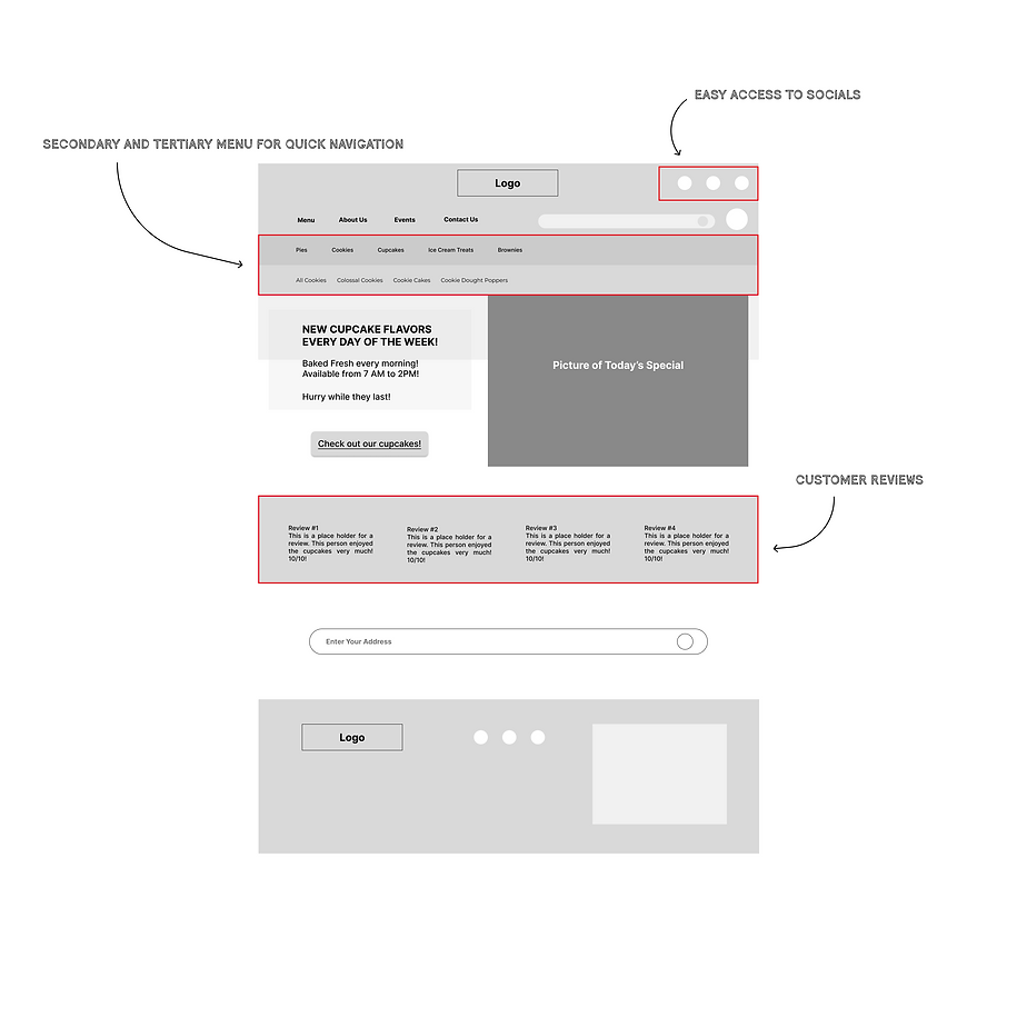
Home Page
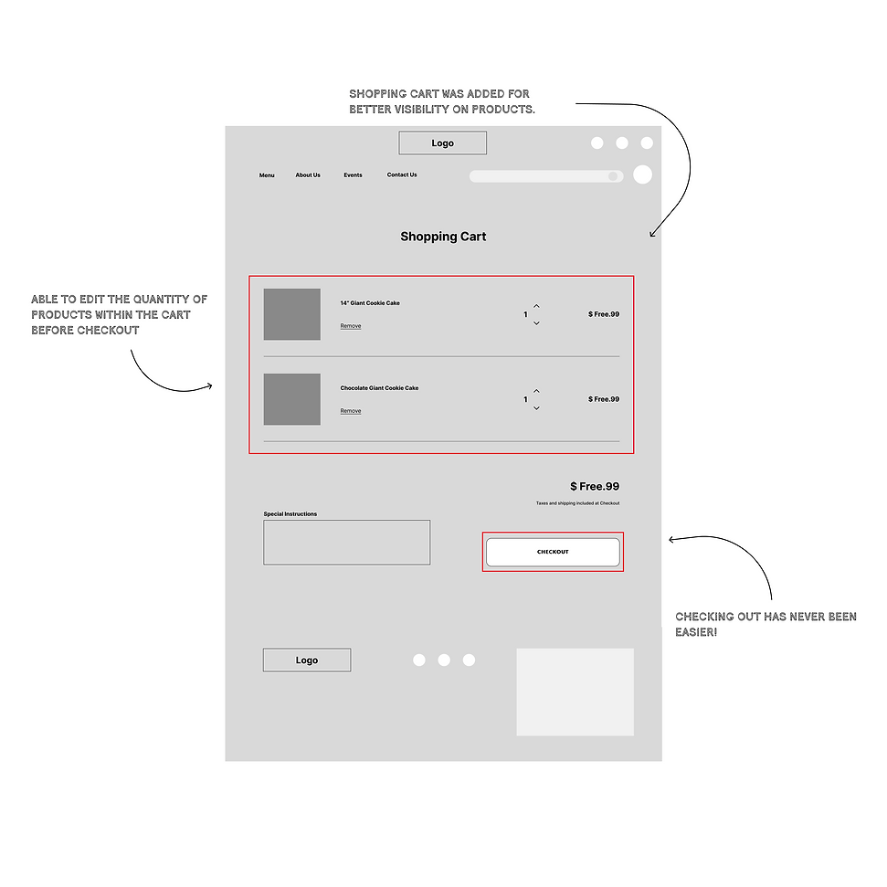
View Cart Page
USER TESTING
When conducting User testing, I wanted to see how easy it would be for an unfamiliar user to:
Navigate to a Product Page, add a product to the cart, and purchase the Item, moving through the Check-out process and ultimately completing the order. Using Maze, I created three tasks to reflect that. Here are the important points:
-
From the initial testing, 75% of participants were able to fully complete the tasks at hand, both direct and indirect.
-
10% of participants were confused on where to find the cookie cakes, causing them to drop off, while the remaining 5% of testers did not finish due to errors.
-
As the testing went on, users felt more at ease in navigating the site, with an average overall success rate of 73%
-
With the results above I was able to implement the following changes:
-
The menu hierarchy was designer to highlight the button the user hovers on, in a color where it was apparent of the selection.
-
The 'Add to Cart' button was also redesigned to be more visible.
COLOR AND TEXT
When it comes to color and text, I decided to go for something that could speak to the name 'Sugar Shack'. Their sweets speak for themselves and they needed a logo and color palette that could do the same. I chose to include their previous teal color and add to it.
Since they are open until 2 AM, I took the idea of a "late night snack", and paired it with a neon sign, creating a more fitting interpretation.

Prototype
HIGH FIDELITY PROTOTYPE
The Redesign for Sugar Shack's website came a long way from its original state, from the addition of smaller features such as Socials, and a clearer more precise walkthrough of the menus, to more challenging yet rewarding changes, such as adding a brand new e-commerce feature and making sure each product is displayed on its own product page. The walkthrough below, showcases my solution to the user's pain points, as well as the interpretation of what Sugar Shack's website could potentially become.
Reflections
Working with an existing site was not only inspiring but also challenging. From evaluating the website, to the creation and implementation of the new features, I made sure to keep Sugar Shack's original charm, important details and of course, as much familiarity from the original as possible. The most challenging part, was finding the right people to interview. Simply asking participants about their dessert preferences wasn't enough information to decipher the necessities of the new site, so I dove deeper, finding folks that have bought a specific dessert, with a specific goal in mind. Having that kind of information not only solidified the important features added, but also pushed the design in the right direction.
NEXT STEPS
Here are a few next steps considered:
Continue to build the website functionality:
- Build out profile page/ account page.
- Build more of the product pages and the layouts.
Further test the hi-fi prototype on the ability to quickly and intuitively lead the user throughout a check-out process, and iterate as necessary.
Address any roadblocks encountered throughout the site.